Clarion 11 RC 2 released

Today’s release is the second “release candidate”, so if you haven’t yet tested with the prior C11 pre-release(s), it would be a good time to review this build. There are a number of fixes/changes and a few new features. You can review the readme with the complete list of features/fixes/changes from here

We are just days away from having a C11 gold release!


Clarion 11 RC1 – update

The Clarion 11 Release Candidate (RC1) was delayed from its delivery on Monday. The two main reasons were a bug report about slower load time for Solutions containing a large number of .APP files (regression), and a report about slow load times in very large .DCT files for the initial selection of a column (old existing issue). In the readme file these correspond with:

CHANGE: A Solution with multiple Applications now gets loaded much faster than earlier Clarion versions. NOTE: Only ONE project with the name the same as the primary App/SLN should exist in the Solution (this would apply for the presence of an item with the same name but with a different file extension)

FIX: DCT Editor was very slow on initial display of the Field/Column information for Columns defined as Derived Columns, if the Table also had Aliases

In debugging the DCT problem, we decided to make it easier to find these types of problems, and to do that we needed a feature. So, now we have this new feature:

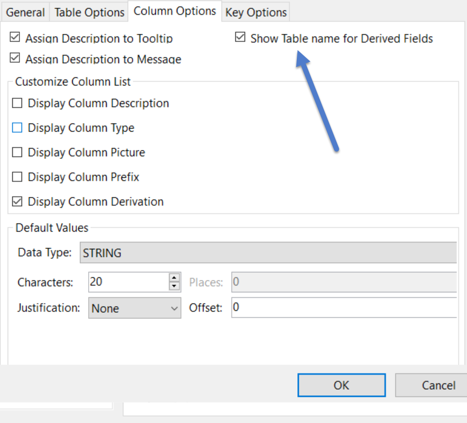
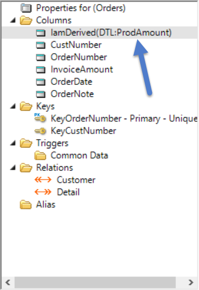
FEATURE: Dictionary Editor Options (Tools->Options->Clarion->Dictionary Editor) new option to display the Parent Table next to the Derived columns

Which looks like this (new DCT option):


FEATURE: OpenFileViaRedirection Dialog now supports writing/pasting a Folder name instead of a file, and it will then open the regular OpenFile Dialog in that directory with the *.* filter selected.

For the File->Open (New Open via RED file):

There are several other important changes/fixes – and all are listed in the readme file.

Clarion 11 RC1 out today

The pre-release Clarion 11 has been a complete success. With only one important regression reported (hidden/missing Tabs on the new Procedure Template dialog). We’ll be releasing an update today to resolve that issue plus a few smaller issues. Today’s release should be considered a release candidate, so if you haven’t yet tested with the C11 pre-release(s), it would be a good time to review this build. In other words we are very close to having a C11 gold release!

We continue our work on the future RTL and compiler, and the compatibility issues we need to resolve. When we deem it ready (after the gold release) we’ll initiate a separate external beta testing program, so that we can assure a seamless experience for all Clarion developers.

Clarion 11 – pre-release to all

Today we are sending out an updated pre-release of Clarion 11 to all developers with a current subscription. Earlier pre-release’s were sent out to allow the Clarion 3rd party community the opportunity to modify their template UI to take advantage of the change to the Template dialog widths. While no changes are “required” (all template functionality is 100% backward compatible), many 3rd party developers have begun to improve their template UI.

When you install C11 and open any of your Apps, you can take a look at the core Template dialogs to see the types of changes that we made on our templates. All reported issues from the early releases have been resolved and we expect the transition to version 11 to be fast and easy.

Clarion11 going out to 3rd party devs

The huge Unicode/ RTL/Compiler/Drivers implementation is progressing nicely but compatibility issues remain (and will take time to eliminate), so a re-think was in order, we have a ton of fixes, changes, and new features, and we have made the decision to release C11 today to the 3rd party  community, so that they can take advantage of the improved Template UI (details below), and modify their templates to make use of the improved UI.

We will continue to work on the compatibility issues while delivering a version of  C11 that assures the Clarion community can transition to version 11 with an absolute minimum of effort. Later on, we’ll release an update that can be run in parallel.

The next section highlights some of the improvements to Clarion 11, for the full list refer to the README.TXT file with the current build.

Templates
The Application Generator’s Template engine has been updated to provide for wider Template Dialogs (~2x wider) – While older templates (pre-C11) will continue to work exactly as before this change, they might not look as good aesthetically. This new implementation will make working with template options a lot nicer (and easier on the eyes). Here are a few screenshots to give you an idea of how we made minor changes to the core templates (ABC and Clarion chains) to take advantage of the new UI possibilities.

There are numerous improvements in the IDE designed to help streamline your development cycle, and here are some of the notable ones:

App file date/timestamp

The Applications Pad now shows the date/timestamp so you can easily identify where you last worked, or what you need to get updated.

Accessing embeds

Requested very often, access to the Embeds is improved with new buttons on the Procedure Properties tab. You have quick access to both “Filled” and “Source” embeds. Less clicks == more productivity.

Full path for the current solution
Another developer request, to make it easier to work with multiple variations of your APPs the full path to the Solution is shown in the Title bar (previously it was just the name of the Solution).

New shortcut button added to the Solutions Pad

User-defined text for indicating a Read-Only status

Usually any file opened in RO mode (like a DCT file opened when you have an APP that uses it loaded) displays the name of the DCT with a + sign
appended to the name, this was possibly a bit too subtle, and some devs lost time/work making mods to the DCT only to find thay couldn’t be saved (unless you closed the .SLN/App). To help with that we introduce user-defined text for read-only files. Here’s a screenshot

and here’s a screenshot of how it looks in action

DCT Editor: implemented new ‘Validation Choices’ dialog to add/edit/visualize, pairs of data, instead of entering a string pair separated by a pipe char (|)

Here’s a screenshot:

Tab Order Assistant / Actions and Embeds

We know that a lot of developers love to work from the TOA (Tab Order Assistant), now we’ve added another reason – direct access to both the Template Actions
and the Embeds for the selected control

Just a mention for one more shortcut, here’s one more in the Solutions Pad

Quick access to often used tasks

SQL drivers and Unicode data

Added support for UNICODE strings on the backend to the ODBC, SQLAnywhere, PSQL, and MSSQL drivers:

‘ using PROP:NAME’ UnicodeFile{PROP:Name, 2} = ‘strFld | UNICODE’

and

‘ using a Driver String’ driverString = driverString & ‘/UNICODE=TRUE’

A Look into what’s coming up next

The docs are done and these are implemented but are pending release to ensure ~100% compatibility.

BSTRING – The BSTRING is equivalent to the OLE API ‘s BSTR data type.

USTRING – Fixed-length Unicode string

VARIANT – The VARIANT is equivalent to the OLE API’s VARIANT data type.

INT64 – a SIGNED 64bit integer

UINT64 – an UNSIGNED 64bit integer

New implementation for Internationalization support

PUSHASTRINGS / POPASTRINGS – new functions for working with the ASTRING type

New user-defined Date pictures

New user-defined Time pictures

CHR function supports Unicode

VAL function supports Unicode

Pictures (@P, @N, @K, new style @D and @T) can use any displayable Unicode character.

Transition to the EMF format for Reports

A quick note

We’ve been extremely busy wrapping up C11 for Alpha/Beta 3rd party testing, updating documentation, and writing tests for all the new functionality coming to C11. In addition, we are also preparing for a final C10 release, and extending the Clarion chain in C11. In previous versions, the Clarion chain was extended to support ABC classes, but only at the local procedure level, in C11 the Clarion chain supports ABC classes at the global level, and that change will allow for the use of H5 in the Clarion chain.

so please be patient… and know that we are hard at work… for you.

StatusBar

New Status bar implementation (C11)

The new implementation of the Status bar is fully backward compatible. This means that if a program doesn’t use any of the new Status bar/style interfaces, the Status bar is drawn exactly the same as the old implementation. If the interfaces are used, besides the improved visual appearance there are the following changes:

– An empty status bar without zones remains visible and can be used to display
the resize gripper.

– Text from the MSG attribute of controls or menu items is drawn in the
leftmost text zone when the control or menu/item has focus.

Before diving into the details here are a couple screenshots

StatusBar

Big StatusBar

The Status bar implementation exposes a set of 3 interfaces:

1) IStatusZone: gives access to properties of a particular zone;
there are 3 extended interfaces derived from it for Text, Image
and Progress zones – ITextZone, IImageZone and IProgressZone

2) IStatusStyle: represents an instance of the style for the Status bar

3) IStatusBar: represents an instance of the Status bar object

– Supported Properties:
1) PROP:StatusInterface – is used to get a reference to the
WINDOW’s Status bar object

2) PROP:StatusStyle – a SYSTEM property to get the reference to
the default status style object

Both properties are read-only but the returned objects can be modified.

– When the Status bar object is created because of OPENing a
WINDOW with the STATUS attribute, or by setting the PROP:Status
property to a WINDOW without a Status bar, the current default style
is used to set up the bar’s appearance. The Status bar uses its own
copy of the style data. Therefore changes in the default style do not
affect existing status bars automatically. The current bar’s
style can be changed by a call to the IStatusBar.ApplyStyle method.

– Because one instance of the status bar object can be shared by
more than one WINDOW, there is no method to destroy an instance of
the IStatusBar interface. For backward compatibility, the
status bar of a WINDOW can be destroyed by specifying a zero width for
the first zone using the PROP:Status property:

Window {PROP:Status, 1} = 0

– The initial state of the default status Style object mimics the traditional
Status bar’s appearance. The only visual difference are the use of different RGB values
for the colors used to draw the Status bar’s upper border and the zones bevels.

The rest of this post contains the details of the new interfaces.

Interfaces:

IStatusZone
———–

GetKind – Returns numeric value of zone’s type as they are
listed in the StatusZoneKind ITEMIZE structure

StatusZoneKind ITEMIZE(0),PRE(STATUSZONE)
TEXT EQUATE
IMAGE EQUATE
PROGRESS EQUATE
END

GetWidth – If passed parameter is TRUE, function returns current
actual width of the zone in pixels including all
margins, optional bevel and optional separator.
If passed parameter is FALSE, function returns the
unadjusted width of zone in dialog units.

SetWidth – Changes the unadjusted width of the zone. Rules are the
same as for value passed to the PROP:Status property.
Unadjusted width is given in zone’s dialog units
and does not include zone margins and the optional separator.

If the value is negative, the zone is expandable with minimum
width (in dlu’s) equal to the absolute value of the passed
number. By default, when A zone is created its
unadjusted width is set equal to -1. For text
zones dialog units are determined by the font used
to draw text in that zone. For zones of other kinds,
dialog units are determined by the font from the
Status bar’s style.

HasBevel – Returns TRUE if a bevel is present around the content
part of the zone, and FALSE if no bevel is present.

SetBevel – Modifies zone’s flag controlling the drawing of the
bevel around content area. The passed parameter must be
one of the values listed in the StatusFlagValue ITEMIZE
structure:

– STATUSFLAG:OFF – to not draw the bevel
– STATUSFLAG:ON – to draw the bevel
– STATUSFLAG:DEFAULT – drawing of the bevel is
determined by status bar’s style.

Default value is STATUSFLAG:DEFAULT.

HasSeparator – Returns TRUE if separator is drawing at the far edge
of the zone and FALSE if no separator is drawing

SetSeparator – Modifies zone’s flag controlling the drawing of the
separator. Passed parameter must be one of values
listed in the StatusFlagValue ITEMIZE structure:

– STATUSFLAG:OFF – do not draw the separator
– STATUSFLAG:ON – draw the separator
– STATUSFLAG:DEFAULT – drawing of the separator is
determined by the Status bar’s style.
Default value is STATUSFLAG:DEFAULT.

If the last zone has the separator flag equal to STATUSFLAG:DEFAULT, the
separator is not drawn regardless of the style settings.

———
ITextZone
———

GetText – Returns the current text of the zone. The returned value can be
passed to the ToString function to convert it to a STRING type.

SetText – Changes the text displayed in the zone. Default value is
an empty string.

GetAlignment – Returns the numeric value of text alignment as they are
listed in the StatusAlignValue ITEMIZE structure. The
STATUSALIGN:DEFAULT and STATUSALIGN:LEFT values are
equivalent.

! Alignment of text in text zones

StatusAlignValue ITEMIZE(0),PRE(STATUSALIGN)
DEFAULT EQUATE
LEFT EQUATE
RIGHT EQUATE
CENTER EQUATE
END

SetAlignment – Changes the text alignment in the zone content area,
Default value is STATUSALIGN:DEFAULT

GetIndent – Returns the value of text indentation in pixels relative to
the base point determined by current alignment.

SetIndent – Changes text indent value to the passed value, countied in
pixels. Default value is 0.

GetFont – Returns an instance of the IFontProperties interface
allowing to modify parameters of the font used to
draw text in the zone. A NULL result means that the zone is
using the font specified by Status bar’s style.

SetFont – Changes the font used to draw text in the zone.
Default value is NULL, i.e. usage of the font from the
Status bar’s style.

*** Notes:

The IFontDescription interface has no public methods to clone and destroy
instances. ITextZone.SetFont automatically releases the previous zone’s
font (unless it is NULL), clones the passed font (unless it is NULL) and
set it to zone. The expected flow of work with a zone’s font is as
follows:

ZoneFont &= BarStyle.GetFont() ! Get the font from style
Zone.SetFont (ZoneFont) ! Set the clone of font to zone
ZoneFont &= Zone.GetFont() ! Get the reference to cloned font
… modify font …
Zone.FontChanged() ! Notify zone that font changed

GetTextColor – Returns the color used to draw text in the zone. If the zone
has its own font, the returned value is equal to
result of call to IFontProperties.FontColor() for this
font. If the zone is using the default font from the bar’s
style, the text color can be changed separately. In this
case, GetTextColor() returns that color value.

SetTextColor – Changes color of==used for drawing text. If the zone has its own
font, this function has the same effect as a call to the
font’s IFontProperties.FontColor(newcolor) method. If the
zone is using the default font from the bar’s style, this
function can be used to change text color in the zone
while retaining all other characteristics of the default
font.

FontChanged – This method must be called to notify the zone that its font has
been changed by calls to methods of the IFontProperties
interface returned by the GetFont function.

IImageZone
———-

GetImage – Returns the name of the image drawn in the zone. Returned
value can be passed to the ToString function to convert
it to STRING type.

SetImage – Sets/changes the image displayed in the zone. Default value is
NULL which means that zone remains blank.

*** Notes:

If the width of zone is greater than the width of the image, the image is drawn
left aligned in the zone content rectangle (right-aligned in case of
right-to-left window layout). If width of the zone is less or equal to the width of
the image, the image is drawn centered in the zone content rectangle.

GetDrawMode – Returns the numeric value of the image drawing mode
as they are listed in the StatusImageMode ITEMIZE
structure.

! Modes of drawing images in image zones

StatusImageMode ITEMIZE(0),PRE(STATUSIMAGE)
NORMAL EQUATE
DISABLED EQUATE
GRAYED EQUATE
END

SetDrawMode – Changes the mode to draw zone image. Parameter must be
one of values listed in the StatusImageMode ITEMIZE
structure. Default value is STATUSIMAGE:NORMAL.

————-
IProgressZone
————-

GetValue – Returns the current progress value.

SetValue – Changes the current progress value.

GetMin – Returns the lower bound for progress value.

GetMax – Returns the upper bound for progress value.

SetRange – Changes the lower and upper bounds for the progress value.
Default range is 0..100

GetColor – Returns the color used to draw the progress bar.

SetColor – Changes the color to draw the progress bar.

*** Notes:

If the progress zone has a bevel, the bevel is used as the frame for
the progress bar. If the zone has no bevel, additional lines are drawn to
show the unfilled part of the progress bar.

————
IStatusStyle
————

Clone – Returns a cloned copy of the style object.

Destroy – Destroys the style object. The Destroy method must
be called for all style objects returned from calls
to IStatusStyle.Clone methods.

CreateBar – Creates the status bar object for the passed WINDOW
using the style determining by SELF. The previous
WINDOW’s status bar object is disposed. It is not
recommended to use this function for the active MDI
child window. Created status bar has no zones and
is frozen.

Apply – Copies information from one style object to another.
Can be used for “atomic” changing of the system
default status style.

GetMetric – Returns the value for the given style metric. Parameter
must be one of values listed in the StatusMetric
ITEMIZE structure.

Supported metrics are:
STATUS:HMARGIN – margin from status bar edge to first
zone and, if no resize gripper is drawn, from
the last zone to the status bar edge. Default value
is 4.

STATUS:ZONEHMARGIN – Horizontal margins around the zone content
rectangle. Default value is 4.

STATUS:ZONEVMARGIN – Vertical margins above and below the zone
content rectangle. Default value is 2.

STATUS:TEXTHMARGIN – Horizontal margins around the
text bounding rectangle in text zones. Default
value is 2.

STATUS:TEXTVMARGIN – Vertical margins above and below the text
bounding rectangle in text zones. Default value
is 0.

STATUS:TEXTINDENT – indentation of text relatively the
base point (determined by text alignment) in the
text bounding rectangle. Default value is 0.

STATUS:SEPMARGIN – margins above and below the zones’
separator line. Default value is 2.

***Notes: All returned values are in pixels.

SetMetric – Changes the given style metric. The first parameter must
be one of values listed in the StatusMetric ITEMIZE
structure.

GetHeight – Returns the height in pixels of the status bar determined
by the style. If the parameter value is FALSE, the function
returns the value set by last call to the SetHeight method.
If parameter is TRUE, function returns adjusted height
value. Adjusted height is maximum of GetHeight(FALSE)
and height calculated from style’s font and metrics.

SetHeight – Changes the unadjusted height for styled status bars.
Passed value must be in pixels. Default value is 0,
i.e. the adjusted height is determined by the font and
metrics.

BkgndBrush – Returns the instance of the IBrush interface used to
draw the Status bar’s background. If IBrush.Type is
CWBrush_Null (default), the background is painted
using the COLOR:BTNFACE color.

GetFont – Returns the instance of the IFontProperties interface
used as the default font for Text zones.

SetFont – Sets/changes the style’s default font. If the passed parameter is NULL
(default), the font specified by SYSTEM properties is used.

GetTextColor – Returns the default color used to draw text in Text
zones.

SetTextColor – Changes the default color used to draw text in Text
zones. If the passed value is COLOR:None, the color returned
by SYSTEM{PROP:FontColor + PROP:StatusFont} is used.

GetProgressColor – Returns the default color used to draw Progress bars in
progress zones.

SetProgressColor – Changes the color used to draw Progress bars in
progress zones.

GetSeparatorColor – Returns the color used to draw flat separator lines.

SetSeparatorColor – Sets/changes the color used to draw flat separator lines.

HasZoneBevel – Returns the default value of the flag to draw bevel around
the content rectangle for zones of a given kind.

SetZoneBevel – Changes default value of the flag to draw the bevel around
content rectangle for zones of the kind given by the first
parameter. Default value is TRUE for text zones and
FALSE for image and progress zones.

GetFlag – Returns value of the style flag corresponding to
passed parameter. Parameter must be one of values
listed in the StausStyleFlag ITEMIZE structure:

STATUS:THEMED – if TRUE, and themes are available for
the program, some metrics and visual aspects are
determined by the visual theme rather than by values
set in the style. If the flag is FALSE, style does not
use the visual theme.

STATUS:SEPARATOR – if TRUE, the separator line is
drawn after every zone except the last one by default.

If the flag is FALSE (default), separators are not
drawn unless this setting is overridden in a
particular zone.

STATUS:GRIPPER – If TRUE, the resize gripper is drawn
in the lower-far corner of status bars owned by resizable
not-maximized WINDOWs. If flag is FALSE (default),
the gripper is not drawn.

STATUS:BORDER3D – If TRUE, the status bar’s upper edge
is drawn using a bevel. If the flag is FALSE, a flat
border is drawn. The flag only affects not-themed
status bars using solid colors to paint the bar’s
background. The flat border is drawn in all other
cases.

STATUS:SEPARATOR3D – If TRUE, separator lines are drawn
using a bevel. If the flag is FALSE, the separator line
is drawn flat. Flag is ignored for themed status
bars.

SetFlag – Changes value of the style flag corresponding to passed
first parameter. This parameter must have one of values
listed in the StatusStyleFlag ITEMIZE structure.

———-
IStatusBar
———-

ApplyStyle – Applies parameters of the passed style to the status bar.

NumZones – Returns the number of zones in the status bar.

GetZone – Returns the reference to object implementing the zone
with passed index. Index value is 1-based. If passed
index is 0 or greater than number of zones, a NULL
reference is returned.

AddZone – Creates the object implementing the zone of given kind
and inserts it at position specified by first parameter.
If position parameter is out of range 1..,
the created zone is appending to the end of list of zones.
The position value is 1-based.

DeleteZone – Destroys the number of zones equal to the second parameter
starting from the position given by the first parameter. By default,
the only zone is creating. If second parameter is 0,
all zones since passed position are destroyed.

*** Notes:

DeleteZone can be used to delete all zones from the status bar. This leaves
an empty status bar.

Freeze – Freezes the status bar to avoid multiple redrawings on
volume changes to zones.

Unfreeze – Unfreezes previously frozen status bar. More than one
level of freezing is possible, therefore the number of calls
to Unfreeze must be equal to number of calls
to Freeze.

SetClickCallback – Sets a callback function that is invoked if the mouse is clicked or
double clicked within content rectangle of any zone. The
1-based index of clicked zone is passed to the callback
function as a parameter. The KEYCODE() function can be used
to determine which mouse button has been clicked.

C10 Update released (November 17)

Today we released another C10 update (build 12799). It’s a small number of fixes primarily aimed at correcting 2 regressions introduced in the prior release (12760 with 150+ fixes/changes/features). It also fixes a couple issues that were isolated to only occur on Windows Server editions, and with some very specific coding conditions.

Here is a link to the readme file with the fixes/changes of both builds.

C10 update released (Nov 8)

Today we released another update for C10. It’s a big release with over 150+ fixes/changes/features. the release includes some small but useful features like export to JSON from Topscan, option to display the Owner/password in Topscan -when Owner is visible as text Copy/Paste is available. (Password icon toggles ON/OFF), improvements to the SystemString and JSON classes, better error handling in the SQL drivers, and much more.

Aside from future bug fixes H5 is now considered code complete. Though we are always looking for feedback and new ideas on areas that we can improve. We’ve also updated the App Broker to use LibreSSL that offers better performance, stability and improved security. LibreSSL is a fork from the OpenSSL stack.

If you want to deliver your app to mobile/tablet devices, give H5 for a try, it takes only minutes to see the possibilities. It also works great on the desktop while at the same time completely changing the UIX of your app.

Read about all the changes in this release here